安卓界面布局解析
- LinearLayout(线性布局)
- RelativeLayout(相对布局)
- ConstraintLayout(约束布局)
- FrameLayout(帧布局)
- TableLayout(表格布局)
- GridLayout(网格布局)
- ScrollView(垂直滚动布局)
- HorizontalScrollView(水平滚动布局)
- CardView(卡片布局)
- ViewPager/ViewPager2(分页滑动布局)
- CoordinatorLayout(协调布局)
- RecyclerView(列表/网格/瀑布流布局)
- AppBarLayout(应用栏布局)
- FlexboxLayout(弹性布局)
- NavigationView(导航抽屉布局,Material Design 扩展)
- MotionLayout(动画驱动布局,ConstraintLayout 子类)
一、基础布局容器
1. 线性布局(LinearLayout)
最简单最常用的布局。子视图线性排列(水平/垂直)
    <LinearLayout
        android:layout_width="wrap_content"
        android:layout_height="wrap_content"
        android:orientation="horizontal">
        <Button
            android:layout_width="wrap_content"
            android:layout_height="wrap_content"
            android:text="点我!" />
        <Button
            android:layout_width="wrap_content"
            android:layout_height="wrap_content"
            android:text="点我!" />
    </LinearLayout>

</LinearLayout>
android:orientation="horizontal | vertical"horizontal:子视图水平排列(从左到右)vertical:子视图垂直排列(从上到下)
android:layout_width="match_parent | wrap_content | 具体数值"match_parent:宽度填满父容器wrap_content:宽度包裹内容大小具体数值:如100dp,指定固定宽度
android:layout_height="match_parent | wrap_content | 具体数值"- 含义与
layout_width相同,控制高度
- 含义与
android:layout_weight="0 | 正数"0:不分配剩余空间(默认)- 正数(如
1,2,0.5):按比例分配剩余空间
android:gravity="top | bottom | left | right | center | center_horizontal | center_vertical"- 控制所有子控件在布局内的对齐方式
- 可组合使用,如:
center_horizontal|bottom
android:layout_gravity="top | bottom | left | right | center | center_horizontal | center_vertical"- 控制单个子控件在父布局中的对齐方式
android:baselineAligned="true | false"true:默认,子控件基线对齐false:不对齐,提升性能
android:baselineAlignedChildIndex="整数"- 设置第几个子控件为基线对齐参考,例如:
1表示第二个子控件
- 设置第几个子控件为基线对齐参考,例如:
android:divider="@drawable/xxx"- 设置子控件之间的分隔线图片或形状
android:showDividers="none | beginning | middle | end"none:不显示beginning:最前显示middle:子控件之间显示end:最后一个后显示- 可组合使用,如:
beginning|middle
android:measureWithLargestChild="true | false"true:所有子控件按最大子控件的尺寸测量false:默认,各自按需测量
适用场景: 按钮组、简单表单、等分布局(如底部导航栏图标)
2. 相对布局(RelativeLayout)
特点:
- 通过相对定位实现复杂布局
- 支持属性如
layout_toRightOf、layout_centerInParent - 相对布局虽然灵活,但过度嵌套可能会导致布局复杂且难以维护。因此,在设计布局时,应尽量简化结构,避免不必要的嵌套。
适用场景:
视图间存在复杂相对位置关系的界面(如聊天消息气泡)
<RelativeLayout
    xmlns:android="http://schemas.android.com/apk/res/android"
    android:layout_width="match_parent"
    android:layout_height="match_parent"
    android:padding="16dp">

    <TextView
        android:id="@+id/title"
        android:layout_width="wrap_content"
        android:layout_height="wrap_content"
        android:text="标题" />

    <Button
        android:layout_width="wrap_content"
        android:layout_height="wrap_content"
        android:layout_below="@id/title"
        android:layout_marginTop="16dp"
        android:text="按钮在标题下面" />
</RelativeLayout>
定位属性:
- android:layout_alignParentTop:与父布局顶部对齐
- android:layout_alignParentBottom:与父布局底部对齐
- android:layout_alignParentLeft:与父布局左侧对齐
- android:layout_alignParentRight:与父布局右侧对齐
- android:layout_alignParentStart:与父布局起始边对齐
- android:layout_alignParentEnd:与父布局结束边对齐
- android:layout_alignTop:与另一个视图顶部对齐
- android:layout_alignBottom:与另一个视图底部对齐
- android:layout_alignLeft:与另一个视图左侧对齐
- android:layout_alignRight:与另一个视图右侧对齐
- android:layout_alignStart:与另一个视图起始边对齐
- android:layout_alignEnd:与另一个视图结束边对齐
- android:layout_above:位于另一个视图上方
- android:layout_below:位于另一个视图下方
- android:layout_toLeftOf:位于另一个视图左侧
- android:layout_toRightOf:位于另一个视图右侧
- android:layout_toStartOf:位于另一个视图起始边
- android:layout_toEndOf:位于另一个视图结束边
- android:layout_centerInParent:在父布局中居中
- android:layout_centerHorizontal:在父布局中水平居中
- android:layout_centerVertical:在父布局中垂直居中
3. 约束布局(ConstraintLayout)
ConstraintLayout与RelativeLayout有些类似,是一个布局管理器(ViewGroup),但要强大许多,用来解决解决嵌套层级过深的问题和应对复杂布局的设计需求(提供了链(Chains)、屏障(Barriers)、引导线(Guidelines)等高级功能)我们使用的时候一般是为了让布局能够根据屏幕大小调整(按比例伸缩)。 链:在某一个方向上有着相互约束的一组子View就是一个链,可以在头部子View上设置样式改变所有子View之间的约束(均分,比例分配)。 组:避免子View的排列方式会产生相互依赖,会有牵一发动全身的情况出现。现在用Group了 使用场景:
- 当线性布局使用(as LinearLayout)可以减少嵌套层级,链式布局(Chains)可以很好的实现动态调整间距比例。
- 当层叠布局使用(as FrameLayout)可换可不换,不用杀鸡用牛刀
- 当相对布局使用(as RelativeLayout)凡是用到RelativeLayout的地方都应该换成ConstaintLayout。引入基线对齐、角度定位(如圆形约束)和Guideline参照线,支持更精确的布局控制
- 在性能上,ConstraintLayout不需要两次测量,性能更优秀
推荐文章:https://juejin.cn/post/6949186887609221133
<androidx.constraintlayout.widget.ConstraintLayout
    xmlns:android="http://schemas.android.com/apk/res/android"
    xmlns:app="http://schemas.android.com/apk/res-auto"
    android:layout_width="match_parent"
    android:layout_height="match_parent"
    android:padding="16dp">

    <TextView
        android:id="@+id/label"
        android:layout_width="wrap_content"
        android:layout_height="wrap_content"
        android:text="我是中心文本"
        app:layout_constraintTop_toTopOf="parent"
        app:layout_constraintBottom_toBottomOf="parent"
        app:layout_constraintStart_toStartOf="parent"
        app:layout_constraintEnd_toEndOf="parent"/>
</androidx.constraintlayout.widget.ConstraintLayout>
二、特殊用途布局
4. 帧布局(FrameLayout)
特点:
- 子视图层叠显示
- 默认以左上角为锚点
- 常用
layout_gravity调整位置
适用场景:
悬浮按钮、叠加图层(如视频播放器的控制栏) 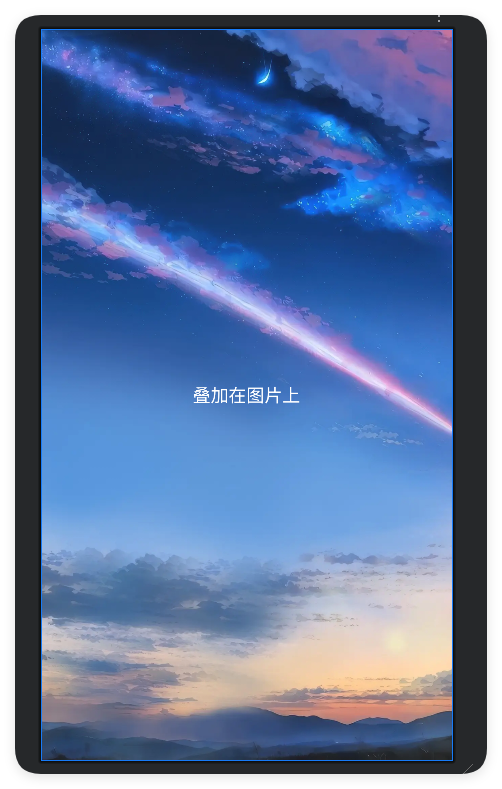
<FrameLayout
    xmlns:android="http://schemas.android.com/apk/res/android"
    android:layout_width="match_parent"
    android:layout_height="match_parent">

    <ImageView
        android:layout_width="match_parent"
        android:layout_height="match_parent"
        android:src="@drawable/bg_sky"
        android:scaleType="centerCrop" />

    <TextView
        android:layout_width="wrap_content"
        android:layout_height="wrap_content"
        android:text="叠加在图片上"
        android:layout_gravity="center"
        android:textColor="#FFFFFF"
        android:textSize="18sp"/>
</FrameLayout>
5. 卡片布局(CardView)
特点:
- 自带圆角阴影效果
- 需依赖
cardview库 - 可设置
cardElevation控制立体感
适用场景:
商品卡片、新闻列表项、信息展示模块
示例: 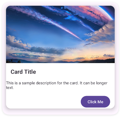
<androidx.constraintlayout.widget.ConstraintLayout xmlns:android="http://schemas.android.com/apk/res/android"
    xmlns:app="http://schemas.android.com/apk/res-auto"
    android:layout_width="match_parent"
    android:layout_height="match_parent">

    <androidx.cardview.widget.CardView
        android:id="@+id/cardView"
        android:layout_width="0dp"
        android:layout_height="wrap_content"
        android:layout_margin="16dp"
        app:cardCornerRadius="16dp"
        app:cardElevation="8dp"
        app:layout_constraintTop_toTopOf="parent"
        app:layout_constraintStart_toStartOf="parent"
        app:layout_constraintEnd_toEndOf="parent">

        <androidx.constraintlayout.widget.ConstraintLayout
            android:layout_width="match_parent"
            android:layout_height="wrap_content">

            <!-- 图片 -->
            <ImageView
                android:id="@+id/imageView"
                android:layout_width="match_parent"
                android:layout_height="200dp"
                android:scaleType="centerCrop"
                android:src="@drawable/bg_sky"
                app:layout_constraintTop_toTopOf="parent" />

            <!-- 标题 -->
            <TextView
                android:id="@+id/titleTextView"
                android:layout_width="wrap_content"
                android:layout_height="wrap_content"
                android:layout_margin="16dp"
                android:text="Card Title"
                android:textSize="20sp"
                android:textStyle="bold"
                app:layout_constraintTop_toBottomOf="@id/imageView"
                app:layout_constraintStart_toStartOf="parent" />

            <!-- 描述 -->
            <TextView
                android:id="@+id/descriptionTextView"
                android:layout_width="wrap_content"
                android:layout_height="wrap_content"
                android:layout_margin="16dp"
                android:text="This is a sample description for the card. It can be longer text."
                android:textSize="14sp"
                app:layout_constraintTop_toBottomOf="@id/titleTextView"
                app:layout_constraintStart_toStartOf="parent"
                app:layout_constraintEnd_toEndOf="parent" />

            <!-- 按钮 -->
            <Button
                android:id="@+id/button"
                android:layout_width="wrap_content"
                android:layout_height="wrap_content"
                android:layout_margin="16dp"
                android:text="Click Me"
                app:layout_constraintTop_toBottomOf="@id/descriptionTextView"
                app:layout_constraintEnd_toEndOf="parent" />

        </androidx.constraintlayout.widget.ConstraintLayout>
    </androidx.cardview.widget.CardView>
</androidx.constraintlayout.widget.ConstraintLayout>
6. 协调布局(CoordinatorLayout)
特点:
- 支持子视图联动行为
- 需配合
Behavior类实现复杂交互 - 常与
AppBarLayout组合使用
适用场景:
可折叠工具栏、视差滚动效果(如豆瓣电影详情页)
推荐阅读:https://segmentfault.com/a/1190000020472057
三、数据驱动布局
7. 列表布局(RecyclerView)
特点:
- 支持千万级数据高效渲染
- 通过
LayoutManager控制排列方式(线性/网格/瀑布流) - 需自定义
Adapter和ViewHolder
适用场景:
社交动态流、电商商品列表、聊天记录
8. 分页布局(ViewPager2)
特点:
- 支持水平/垂直滑动分页
- 基于
RecyclerView重构 - 与
TabLayout联动实现标签导航
适用场景:
图片轮播、教程引导页、分类信息切换(如知乎顶部导航)
四、表格与网格布局
9. 传统表格(TableLayout)
特点:
- 通过
TableRow定义行 - 自动平均分配列宽
- 支持
layout_span合并单元格
适用场景:
数据报表、设置选项分组(如WIFI网络列表)
10. 网格布局(GridLayout)
特点:
- 精确控制行列分布
- 支持动态添加子视图
- 替代方案:
RecyclerView+GridLayoutManager
适用场景:
九宫格菜单、日历视图、图标矩阵
五、滚动与响应布局
11. 垂直滚动(ScrollView)
特点:
- 仅支持单方向滚动
- 必须包含一个直接子容器
- 嵌套
RecyclerView需禁用滑动冲突
适用场景:
长表单、文章阅读页、配置页面
12. 水平滚动(HorizontalScrollView)
特点:
- 实现横向内容滑动
- 典型组合:
LinearLayout+横向排列
适用场景:
横向标签栏、时间轴、画廊预览
六、Material Design 增强布局
13. 应用栏布局(AppBarLayout)➦参考文档
特点:
- 实现工具栏折叠效果
- 必须作为
CoordinatorLayout子元素 - 配合
CollapsingToolbarLayout使用
适用场景:
可折叠标题栏(如支付宝个人中心)、视差滚动头部
14. 弹性布局(FlexboxLayout)
特点:
- 类似CSS Flex布局
- 支持自动换行/间距调整
- 需引入
flexbox库
适用场景:
动态标签流、瀑布流图片墙、自适应排列元素